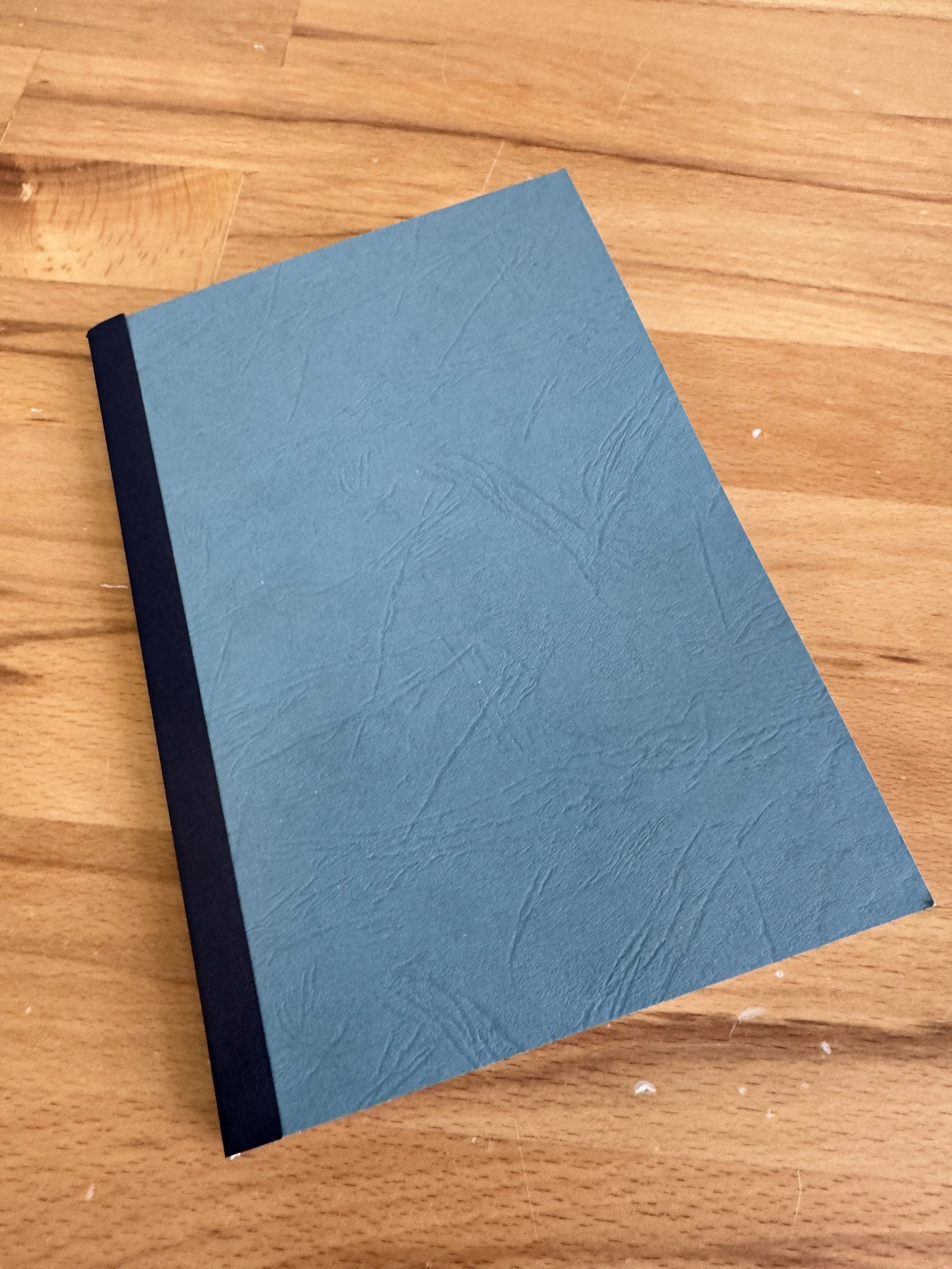
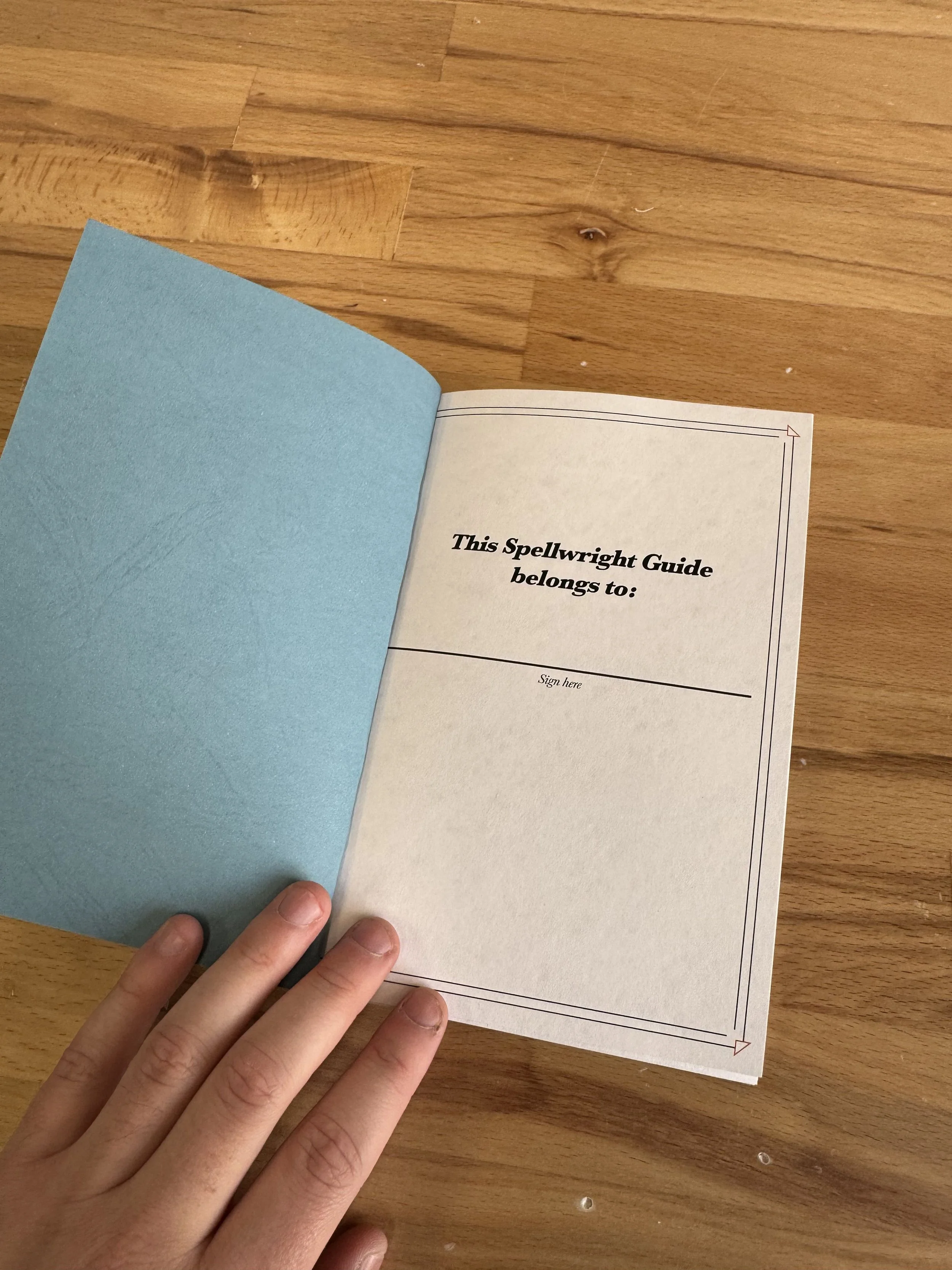
Spellwright Habit Journal
Jordan McDonald
2024
Design - Printed book
Life is often overwhelming. The modern age has connected us in a way that is remarkable, and often invasive. We are always online, tethered, engaged. I find that it can be very beneficial to take time to step back, reset and clear your head. Physically writing is a wonderful way to go about this. I wanted to create something to encourage this, more than just a journal.
Inspired by similar items, I set out to create my own habit journal. The magical theme seemed natural to me, an extension of the power that small changes can have. Doing something that affects the world is spellcraft, and this is your spellbook.
why a habit journal?
A journal does nothing without the input of a user’s writing. Journals are items that are associated with repeated, often daily use.
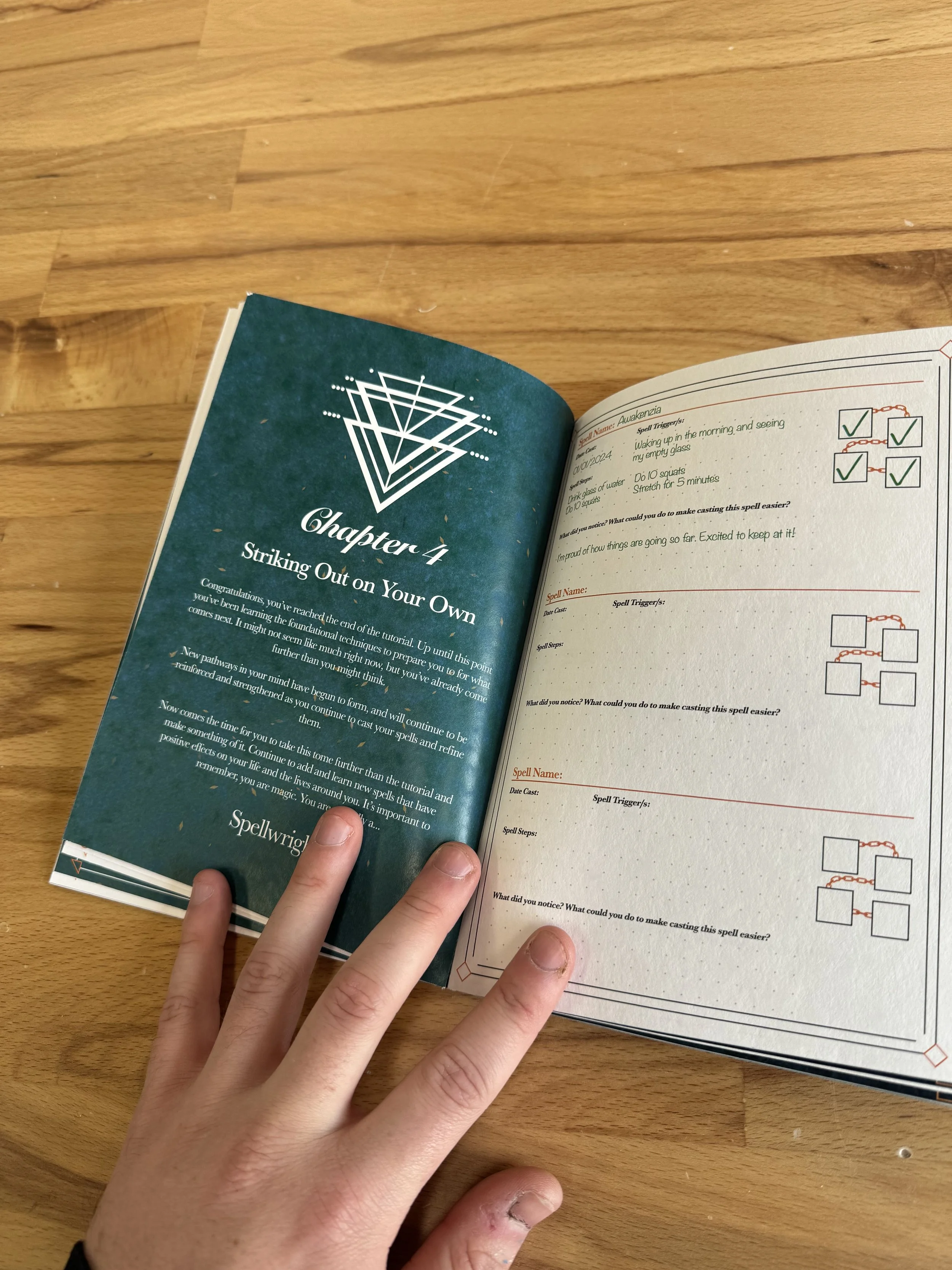
Asks the user to interact with the journal physically rather than digitally. Less frantic, slower paced process that encourages reflection, introspection and lack of distraction.
Even now, magic has incredibly strong connotations with physical processes: scrolls, parchment, ink, spellbooks.
The word spell being both magic and about language. The suffix “wright”, meaning a practitioner of some sort, such as “playwright”.
By connecting the experience of writing with the daily process of tracking habitual progress and the rewarding feelings that come with meeting goals, I hope to create a positive association with writing itself.
The journal will remain as a physical item that can be looked back on to see progress and improvement.
early mockups
I spent some time carefully considering what I wanted to present in my work. I wanted to reveal something unseen about an environment, I wanted to represent sound visually.
I set myself a brief. Represent the soundscape of an environment in such a way that it mirrors the environment itself.
In terms of the environment, I had to use what I had at hand, Canberra itself. I went for a walk into the heart of Black Mountain, near the CSIRO compound, and found a secluded area filled with the sounds I wanted to capture: leaves blowing in the wind, a gentle stream running, and birds singing above. I set up a small recording studio comprised of a laptop and a Blue Yeti Nano microphone on a tripod, and left it to record for approximately five minutes.
This soundwave is what I would use to create my visual.
iconography
These were inspired by both the triangular shape of the Valknot from Norse Mythology, as well as the symbols for the Empedoclean classical elements of fire, water, earth and air. As these four elements were though to come together to create the world, I wished for the Spellwright symbols to come together to represent further knowledge, experience and training.
To better connect the Ritual page spreads to my vision of reflection under the stars, I started with the moon as the basis for Ritual symbols. Beginning with a crescent moon at the center, I explored using shared elements in symmetrical patterns. My intention was for the light line weights and circles to be reminiscent of astrological star signs, which have strong connotations in magic, fate and mythology.
Layout Development
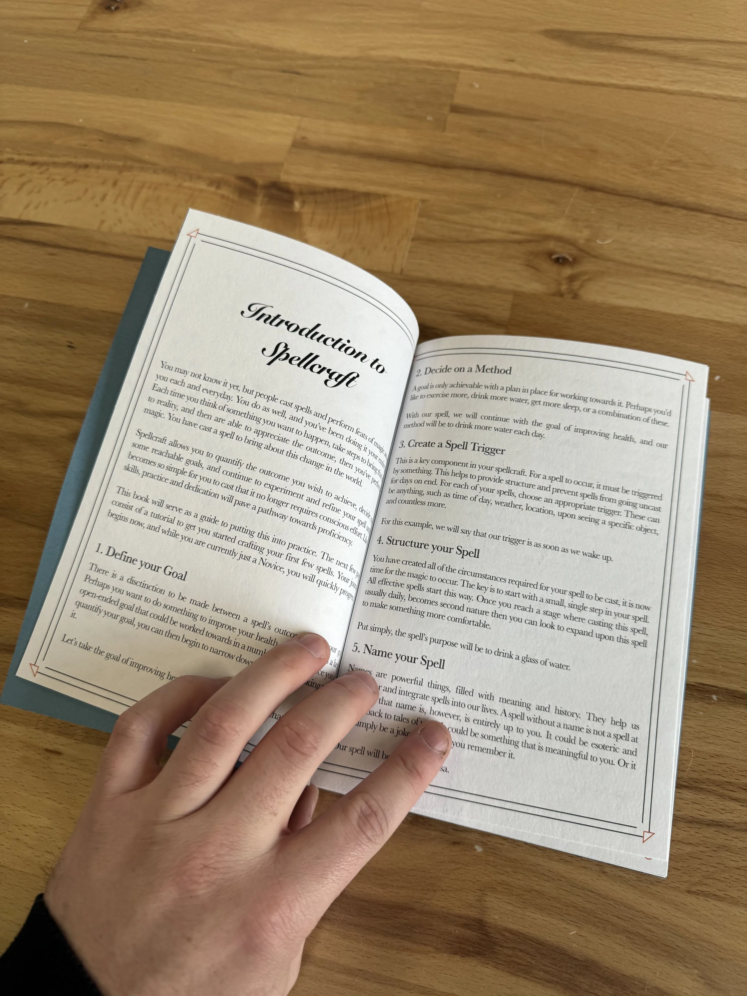
In designing the layout and visual style of the Spellwright Habit Journal, I wanted to mirror early printed books. This involved strong text justification, serif typefaces, and an emphasis on grid and framing. To that end, I kept much of the layout rather simple with a focus on the text. Much of the body copy was made with the Baskerville typeface designed by John Baskerville in the 1750s, to harken back to early physical typesetting. In contrast, the chapter titles are in Snell Roundhand, a popular script typeface modelled directly on the handwriting of 17th century English writer Charles Snell. My intention was for both typefaces to provide a period appropriate feel to the contents of the book.
In designing the frames that would wrap each page of the journal , I considered highly ostentatious, art nouveau-styled frames. However, these seemed to severely reduce page space in what was ultimately a book to be written in. Instead, I opted for rather simple but strong grid frames, with a highlighted corner shape. Each section of the book contains a distinct frame shape to better differentiate location when flicking quickly through pages.


